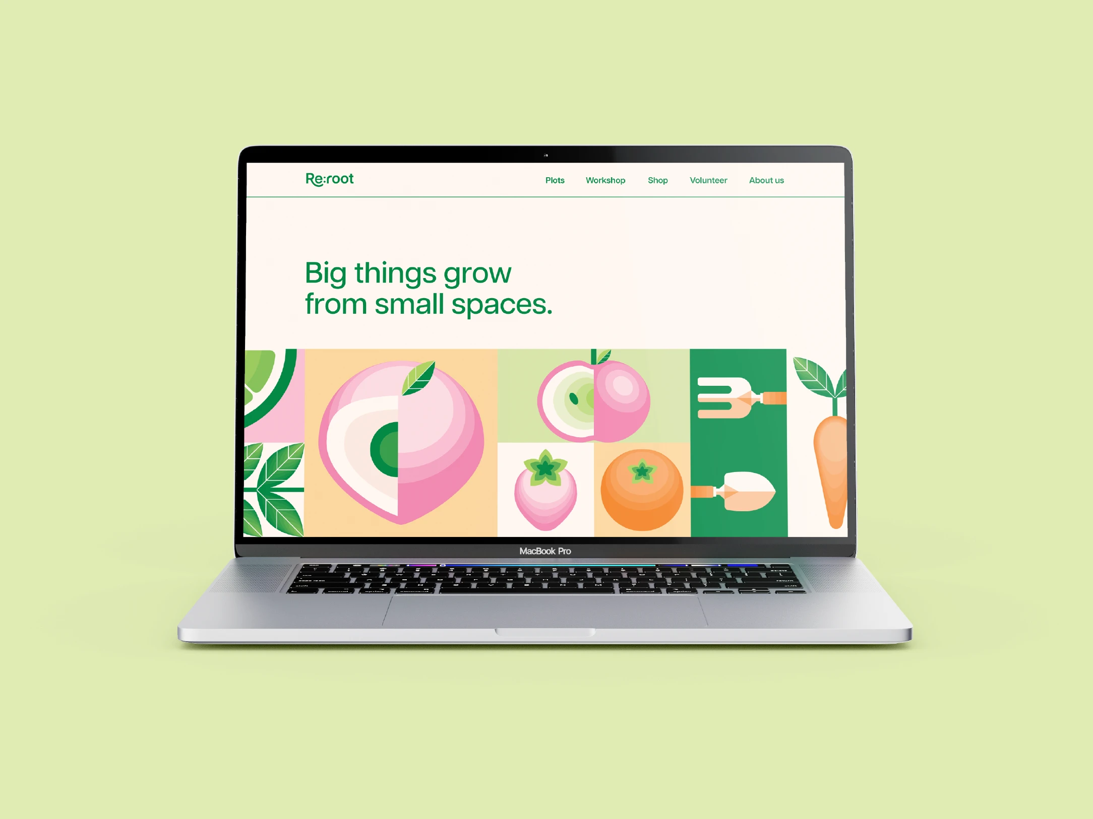
Re:root Campaign
Brand Design | UX Design | Animation | Packaging Design
Designed for my final year project, Re:root is an integrated campaign targeting urban areas across Ireland that encourages people to rethink the space around them by offering plots of unused council-owned land as allotments and teaching new skills to people of all ages so they can grow their own food.
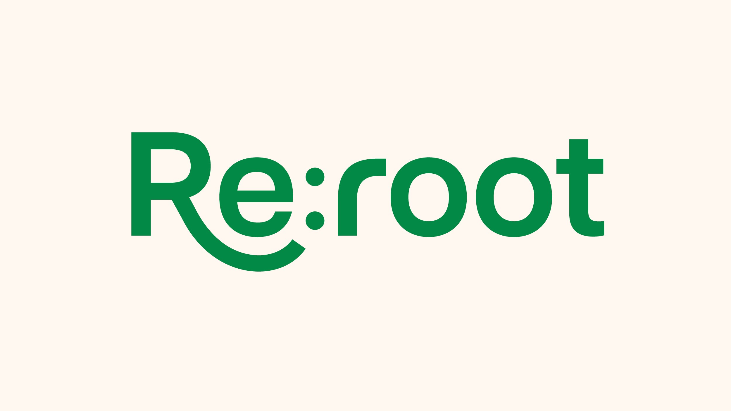
Visual Identity
The name of the campaign comes from 'Re:' meaning to do something again in a positive manner and 'Root' referencing plants, food and community. The logo has an elongated 'R' a visual reference to roots growing beneath the surface.
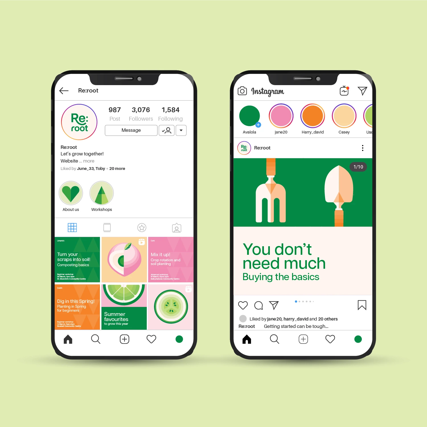
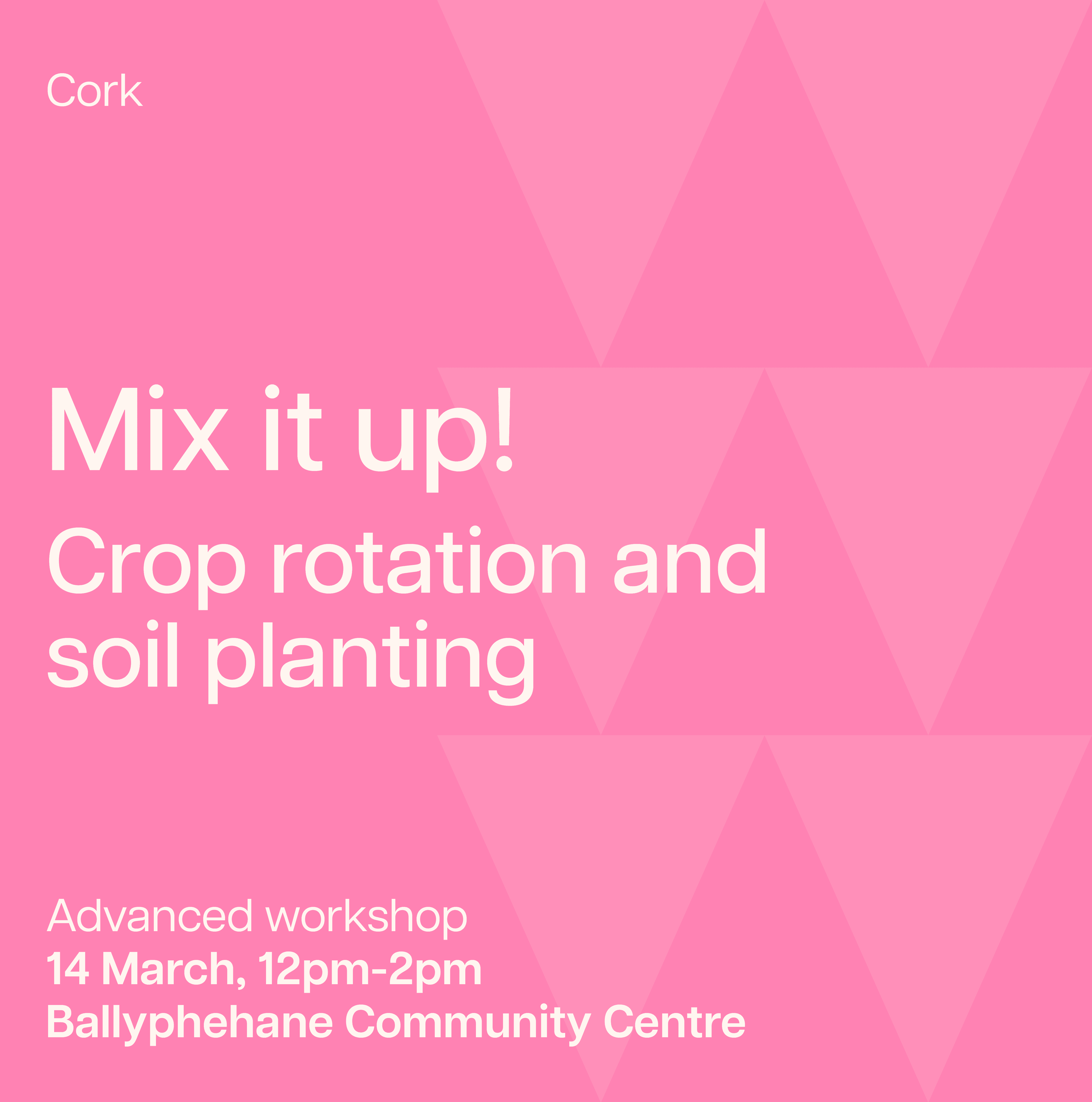
The visuals are designed to be colourful and playful to be suitable for all ages as the campaign targets children to adults and so that the campaign feels approachable and fun.
Visual system
The campaign uses a modular design system that can be mixed and matched depending on the context it's being used in. The icons exist under 4 headings, tools, growth, food and community, all key aspects of the campaign.



The Website
The website is a key part of the campaign where people can visit to learn all about the campaign, check upcoming workshops, find simple instructions for growing food
and use the interactive map to apply for their own plot.